Build new dashboards with HTML
❗This feature is only available on v1 dashboards and is not currently supported on v2. For more information on the new Custom Dashboards check this documentation.
You can build dashboards with Netdata charts just with some basic HTML knowledge.
These dashboards allow you to utilize any or all of the available chart libraries, on the same dashboard. You can use data from one or more Netdata servers, on the same dashboard and host your dashboard HTML page on any web server, anywhere. You can also add Netdata charts to existing web pages.
Check this very simple working example of a dashboard.
You should also look at the dashboard template, which contains samples of all supported charts. The code is here.
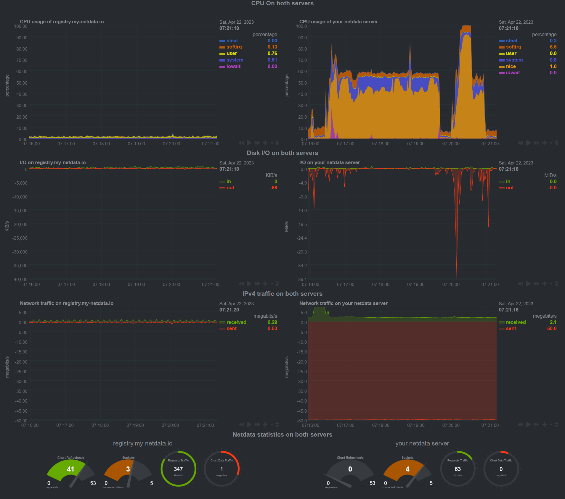
If you plan to put the dashboard on TV, check out tv.html. Here's is a screenshot of it, monitoring two servers on the same page:
Web directory
All of the mentioned examples are available on your local Netdata installation
(e.g. http://myhost:19999/dashboard.html). The default web root directory with
the HTML and JS code is /usr/share/netdata/web. The main dashboard is also in
that directory and called index.html.\
Note: index.html has a different syntax. Don't use it as a template for simple dashboards.
Some operating systems will use
/opt/netdata/usr/share/netdata/webas the web directory. If you're not sure where yours is, navigate tohttp://NODE:19999/netdata.confin your browser, replacingNODEwith the IP address or hostname of your node, and find the# web files directory =setting. The value listed is the web directory for your system.
Example empty dashboard
If you need to create a new dashboard on an empty page, we suggest the following header:
<!DOCTYPE html>
<html lang="en">
<head>
  <title>Your dashboard</title>

  <meta http-equiv="Content-Type" content="text/html; charset=utf-8" />
  <meta charset="utf-8">
  <meta http-equiv="X-UA-Compatible" content="IE=edge,chrome=1">
  <meta name="viewport" content="width=device-width, initial-scale=1">
  <meta name="apple-mobile-web-app-capable" content="yes">
  <meta name="apple-mobile-web-app-status-bar-style" content="black-translucent">

  <!-- here we will add dashboard.js -->

</head>
<body>

<!-- here we will add charts -->

</body>
</html>
dashboard.js
To add Netdata charts to any web page (dedicated to Netdata or not), you need to
include the /dashboard.js file of a Netdata server.
For example, if your Netdata server listens at http://box:19999/, you will
need to add the following to the head section of your web page:
<script type="text/javascript" src="http://box:19999/dashboard.js"></script>
What does dashboard.js do?
dashboard.js will automatically load the following:
dashboard.css, required for the Netdata chartsjquery.min.js, (only if jQuery is not already loaded for this web page)bootstrap.min.js(only if Bootstrap is not already loaded) andbootstrap.min.css.You can disable this by adding the following before loading
dashboard.js:
<script>var netdataNoBootstrap = true;</script>
jquery.nanoscroller.min.js, required for the scrollbar of the chart legends.bootstrap-toggle.min.jsandbootstrap-toggle.min.css, required for the settings toggle buttons.font-awesome.min.css, for icons.
When dashboard.js loads will scan the page for elements that define charts
(see below) and immediately start refreshing them. Keep in mind more javascript
modules may be loaded (every chart library is a different javascript file, that
is loaded on first use).
Prevent dashboard.js from starting chart refreshes
If your web page is not static and you plan to add charts using JavaScript, you
can tell dashboard.js not to start processing charts immediately after loaded,
by adding this fragment before loading it:
<script>var netdataDontStart = true;</script>
The above, will inform the dashboard.js to load everything, but not process the web page until you tell it to.
You can tell it to start processing the page, by running this javascript code:
NETDATA.start();
Be careful not to call the NETDATA.start() multiple times. Each call to this
function will spawn a new thread that will start refreshing the charts.
If, after calling NETDATA.start() you need to update the page (or even get
your javascript code synchronized with dashboard.js), you can call (after you
loaded dashboard.js):
NETDATA.pause(function() {
 // ok, it is paused

 // update the DOM as you wish

 // and then call this to let the charts refresh:
 NETDATA.unpause();
});
The default Netdata server
dashboard.js will attempt to auto-detect the URL of the Netdata server it is
loaded from, and set this server as the default Netdata server for all charts.
If you need to set any other URL as the default Netdata server for all charts
that do not specify a Netdata server, add this before loading dashboard.js:
<script type="text/javascript">var netdataServer = "http://your.netdata.server:19999";</script>
Adding charts
To add charts, you need to add a div for each of them. Each of these div
elements accept a few data- attributes:
The chart unique ID
The unique ID of a chart is shown at the title of the chart of the default
Netdata dashboard. You can also find all the charts available at your Netdata
server with this URL: http://your.netdata.server:19999/api/v1/charts
(example).
To specify the unique id, use this:
<div data-netdata="unique.id"></div>
The above is enough for adding a chart. It most probably have the wrong visual settings though. Keep reading...
The duration of the chart
You can specify the duration of the chart (how much time of data it will show) using:
<div data-netdata="unique.id"
 data-after="AFTER_SECONDS"
 data-before="BEFORE_SECONDS"
 ></div>
AFTER_SECONDS and BEFORE_SECONDS are numbers representing a time-frame in
seconds.
The can be either:
absolute unix timestamps (in javascript terms, they are
new
Date().getTime() / 1000
. Using absolute timestamps you can have a chart showing always the same time-frame.relative number of seconds to now. To show the last 10 minutes of data,
AFTER_SECONDSmust be-600(relative to now) andBEFORE_SECONDSmust be0(meaning: now). If you want the chart to auto-refresh the current values, you need to specify relative values.
Chart sizes
You can set the size of the chart using this:
<div data-netdata="unique.id"
 data-width="WIDTH"
 data-height="HEIGHT"
 ></div>
WIDTH and HEIGHT can be anything CSS accepts for width and height (e.g.
percentages, pixels, etc). Keep in mind that for certain chart libraries,
dashboard.js may apply an aspect ratio to these.
If you want dashboard.js to permanently remember (browser local storage) the
dimensions of the chart (the user may resize it), you can add: data-id="
SETTINGS_ID", where SETTINGS_ID is anything that will be common for this
chart across user sessions.
Netdata server
Each chart can get data from a different Netdata server. You can specify the Netdata server to use for each chart using:
<div data-netdata="unique.id"
 data-host="http://another.netdata.server:19999/"
 ></div>
If you have ephemeral monitoring setup (More info here) and have no direct access to the nodes dashboards, you can use the following:
<div data-netdata="unique.id"
 data-host="http://yournetdata.server:19999/host/reported-hostname"
 ></div>
Chart library
Netdata supports a number of chart libraries. The default chart library is
dygraph, but you can set a different chart library per chart using
data-chart-library:
<div data-netdata="unique.id"
 data-chart-library="gauge"
 ></div>
Each chart library has a number of specific settings. To learn more about them,
you should investigate the documentation of the given chart library, or visit
the appropriate JavaScript file that defines the library's options. These files
are concatenated into the monolithic dashboard.js for deployment.
Data points
For the time-frame requested, dashboard.js will use the chart dimensions and
the settings of the chart library to find out how many data points it can show.
For example, most line chart libraries are using 3 pixels per data point. If the
chart shows 10 minutes of data (600 seconds), its update frequency is 1 second,
and the chart width is 1800 pixels, then dashboard.js will request from the
Netdata server: 10 minutes of data, represented in 600 points, and the chart
will be refreshed per second. If the user resizes the window so that the chart
becomes 600 pixels wide, then dashboard.js will request the same 10 minutes of
data, represented in 200 points and the chart will be refreshed once every 3
seconds.
If you need the chart to show a fixed number of points, you can set the data-points option. Replace DATA_POINTS with the number of points you need:
<div data-netdata="unique.id"
 data-points="DATA_POINTS"
 ></div>
You can also overwrite the pixels-per-point per chart using this:
<div data-netdata="unique.id"
 data-pixels-per-point="PIXELS_PER_POINT"
 ></div>
Where PIXELS_PER_POINT is the number of pixels each data point should occupy.
Data grouping method
Netdata supports average (the default), sum and max grouping methods. The grouping method is used when the Netdata server is requested to return fewer points for a time-frame, compared to the number of points available.
You can give it per chart, using:
<div data-netdata="unique.id"
 data-method="max"
 ></div>
Changing rates
Netdata can change the rate of charts on the fly. So a charts that shows values per second can be turned to per minute (or any other, e.g. per 10 seconds), with this:
<div data-netdata="unique.id"
 data-method="average"
 data-gtime="60"
 data-units="per minute"
 ></div>
The above will provide the average rate per minute (60 seconds). Use 60 for
/minute, 3600 for /hour, 86400 for /day (provided you have that many
data).
- The
data-gtimesetting does not change the units of the chart. You have to change them yourself withdata-units. - This works only for
data-method="average". - Netdata may aggregate multiple points to satisfy the
data-pointssetting. For example, you requestper minutebut the requested number of points to be returned are not enough to report every single minute. In this case Netdata will sum theper secondraw data of the database to find theper minutefor every single minute and then average them to find the average per minute rate of every X minutes. So, it works as if the data collection frequency was per minute.
Selecting dimensions
By default, dashboard.js will show all the dimensions of the chart. You can
select specific dimensions using this:
<div data-netdata="unique.id"
 data-dimensions="dimension1,dimension2,dimension3,..."
 ></div>
Netdata supports coma (,) or pipe (|) separated simple
patterns for dimensions. By default it
searches for both dimension IDs and dimension NAMEs. You can control the target
of the match with: data-append-options="match-ids" or
data-append-options="match-names". Spaces in data-dimensions="" are matched
in the dimension names and IDs.
Chart title
You can overwrite the title of the chart using this:
<div data-netdata="unique.id"
 data-title="my super chart"
 ></div>
Chart units
You can overwrite the units of measurement of the dimensions of the chart, using this:
<div data-netdata="unique.id"
 data-units="words/second"
 ></div>
Chart colors
dashboard.js has an internal palette of colors for the dimensions of the
charts. You can prepend colors to it (so that your will be used first) using
this:
<div data-netdata="unique.id"
 data-colors="#AABBCC #DDEEFF ..."
 ></div>
Extracting dimension values
dashboard.js can update the selected values of the chart at elements you
specify. For example, let's assume we have a chart that measures the bandwidth
of eth0, with 2 dimensions in and out. You can use this:
<div data-netdata="net.eth0"
 data-show-value-of-in-at="eth0_in_value"
 data-show-value-of-out-at="eth0_out_value"
 ></div>

My eth0 interface, is receiving <span id="eth0_in_value"></span>
and transmitting <span id="eth0_out_value"></span>.
Hiding the legend of a chart
On charts that by default have a legend managed by dashboard.js you can remove
it, using this:
<div data-netdata="unique.id"
 data-legend="no"
 ></div>
API options
You can append Netdata REST API v1 data options, using this:
<div data-netdata="unique.id"
 data-append-options="absolute,percentage"
 ></div>
A few useful options are:
absoluteto show all values are absolute (i.e. turn negative dimensions to positive)percentageto express the values as a percentage of the chart total (so, the values of the dimensions are added, and the sum of them if expressed as a percentage of the sum of all dimensions)unalignedto prevent Netdata from aligning the charts (e.g. when requesting 60 seconds aggregation per point, Netdata returns chart data aligned to XX:XX:00 to XX:XX:59 - similarly for hours, days, etc - theunalignedoption disables this feature)match-idsormatch-namesis used to control whatdata-dimensions=will match.
Chart library performance
dashboard.js measures the performance of the chart library when it renders the
charts. You can specify an element ID you want this information to be
visualized, using this:
<div data-netdata="unique.id"
 data-dt-element-name="measurement1"
 ></div>

refreshed in <span id="measurement1"></span> milliseconds!
Syncing charts y-range
If you give the same data-common-max="NAME" to 2+ charts, then all of them
will share the same max value of their y-range. If one spikes, all of them will
be aligned to have the same scale. This is done for the cpu interrupts and and
cpu softnet charts at the dashboard and also for the gauge and easypiecharts
of the Netdata home page.
<div data-netdata="chart1"
 data-common-max="chart-group-1"
 ></div>

<div data-netdata="chart2"
 data-common-max="chart-group-1"
 ></div>
The same functionality exists for data-common-min.
Syncing chart units
Netdata dashboards support auto-scaling of units. So, MB can become KB,
GB, etc dynamically, based on the value to be shown.
Giving the same NAME with data-common-units= "NAME", 2+ charts can be forced
to always have the same units.
<div data-netdata="chart1"
 data-common-units="chart-group-1"
 ></div>

<div data-netdata="chart2"
 data-common-units="chart-group-1"
 ></div>
Setting desired units
Charts can be scaled to specific units with data-desired-units=" UNITS". If
the dashboard can convert the units to the desired one, it will do.
<div data-netdata="chart1"
 data-desired-units="GB"
 ></div>
Chart library settings
Dygraph
You can set the min and max values of the y-axis using
data-dygraph-valuerange=" [MIN, MAX] ".
EasyPieChart
Value range
You can set the max value of the chart using the following snippet:
<div data-netdata="unique.id"
 data-chart-library="easypiechart"
 data-easypiechart-max-value="40"
 ></div>
Be aware that values that exceed the max value will get expanded (e.g. "41" is still 100%). Similar for the minimum:
<div data-netdata="unique.id"
 data-chart-library="easypiechart"
 data-easypiechart-min-value="20"
 ></div>
If you specify both minimum and maximum, the rendering behavior changes. Instead
of displaying the value based from zero, it is now based on the range that is
provided by the snippet:
<div data-netdata="unique.id"
 data-chart-library="easypiechart"
 data-easypiechart-min-value="20"
 data-easypiechart-max-value="40"
 ></div>
In the first example, a value of 30, without specifying the minimum, fills the chart bar to '75 %(100% / 40 * 30). However, in this example the range is now20(40 - 20 = 20). The value30 will fill the chart to ** '50 %**, since it's in the middle between 20 and 40.
This scenario is useful if you have metrics that change only within a specific range, e.g. temperatures that are very unlikely to fall out of range. In these cases it is more useful to have the chart render the values between the given min and max, to better highlight the changes within them.
Negative values
EasyPieCharts can render negative values with the following flag:
<div data-netdata="unique.id"
 data-chart-library="easypiechart"
 data-override-options="signed"
 ></div>
Negative values are rendered counter-clockwise.
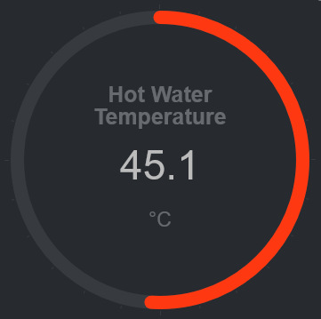
Full example with EasyPieChart
This is a chart that displays the hotwater temperature in the given range of 40 to 50.
<div data-netdata="acme_system.hotwater.hotwatertemp"
 data-title="Hot Water Temperature"
 data-decimal-digits="1"
 data-chart-library="easypiechart"
 data-colors="#FE3912"
 data-width="55%"
 data-height="50%"
 data-points="1200"
 data-after="-1200"
 data-dimensions="actual"
 data-units="°C"
 data-easypiechart-max-value="50"
 data-easypiechart-min-value="40"
 data-common-max="netdata-hotwater-max"
 data-common-min="netdata-hotwater-min"
></div>
Do you have any feedback for this page? If so, you can open a new issue on our netdata/learn repository.