Netdata Charts
Netdata charts provide real-time, per-second metrics to help you troubleshoot and explore your infrastructure with high-resolution insights.
What Makes Netdata Charts Special
Netdata excels at collecting, storing, and presenting metrics in ready-to-use dashboards. Its enhanced charts update every second and offer:
- High-resolution, granular metrics
- Interactive data exploration through metric hover overlays
- Customizable filtering using the Definition bar
- Anomaly detection via the Anomaly Rate ribbon
- Intuitive tools for panning, zooming, and highlighting areas of interest
- Quick access to Metric Correlations for finding patterns across metrics
- Flexible dimension sorting by name, value, or anomaly rate
- Detailed chart information including plugin, context, and type
- Real-time status of metric collection
- Access to the underlying data via the Data Queries API for advanced use cases
You can view these charts in Netdata Cloud’s Metrics tab, individual node views, and Custom Dashboards.
Metric Correlations
Netdata charts allow you to quickly identify related metrics using the Metric Correlations feature. When you highlight an area of interest on a chart (such as a spike or anomaly), Netdata suggests other metrics that display similar behavior during the same timeframe.
This helps you find root causes or related system activity without manually searching through all metrics.
Learn more: Metric Correlations documentation
Chart Anatomy
Each Netdata chart is designed to provide quick insights and interactive exploration:
| Chart Element | Description |
|---|---|
| Title bar | Shows the chart title and units of measurement |
| Anomaly Rate ribbon | Displays the combined anomaly rate of all data |
| Definition bar | Provides filtering and grouping options |
| Toolbar | Offers tools for interacting with the chart |
| Chart area | Displays the metrics data |
| Legend with dimensions | Lists all metric dimensions with color coding |
Core Concepts
Understanding how Netdata organizes and presents metrics helps you make the most of its charts.
Dimensions
A dimension is a value shown on a chart. Dimensions can represent:
- Raw collected data
- Calculated values (such as average, minimum, or maximum)
- Various units (such as percentages, MiB/s, GiB)
Each chart’s legend lists its dimensions. You can hide or show specific dimensions to focus on what matters most.
Contexts
A context groups charts by metric type and displayed dimensions. Contexts define how charts are organized and where they appear in the Netdata menu.
Examples:
apps.cpufor Apps CPU Timeapps.memfor Apps Real Memory
The part before the dot (.) is the type, while the part after is defined by the chart’s developer or its family.
Contexts are also used for alert configurations.
Families
A family represents a specific instance of a hardware or software resource that needs its own chart.
For example, in disk monitoring:
- Disk drives like
sdaandsdbeach have their own family.
The combination of context and family forms the [context].[family] naming scheme:
| Context | sda family | sdb family |
|---|---|---|
disk.io | disk_io.sda | disk_io.sdb |
disk.ops | disk_ops.sda | disk_ops.sdb |
disk.backlog | disk_backlog.sda | disk_backlog.sdb |
disk.util | disk_util.sda | disk_util.sdb |
Title Bar
The Title bar provides essential information and quick actions for each chart:
| Title Bar Element | Description |
|---|---|
| Netdata icon | Indicates live data updates (when time is playing) |
| Chart title | Shows the title, metric, and unit of measurement |
| Chart status icon | Displays loading, timeout, error, or no-data status |
Quick actions available from the Title bar:
| Action | Description |
|---|---|
| Manage Alerts | Configure alerts for this chart |
| Chart info | View detailed chart metadata |
| Chart type | Switch between line, stacked, area, bar, and multi-bar views |
| Enter fullscreen | Expand the chart for full-screen analysis |
| User settings | Save chart preferences across dashboard reloads |
| Drag and Drop | Add the chart to an existing or new dashboard |
User Settings Priority
When configuring chart preferences using the User Settings action in the Title Bar, Netdata applies the following priority order:
Personal settings: Highest priority, specific to the individual user.
Room settings: Shared across users in the same Room if no personal settings exist.
Space settings: Global defaults across the Space if no Room or personal settings exist.
This hierarchy ensures that your personal preferences always take precedence, while still allowing collaborative defaults at the Room or Space level.
Definition Bar
The Definition bar provides powerful filtering and grouping options, helping you explore your metrics more effectively:

| Definition Bar Element | Description |
|---|---|
| Group by option | Choose how to group your data visualization |
| Aggregate function | Select how to aggregate data from multiple sources |
| Nodes filter | Filter data from specific nodes |
| Instances filter | Filter specific instances of data |
| Dimensions filter | Filter particular dimensions |
| Labels filter | Filter by specific labels |
| Time aggregation | Control how data points are aggregated over time |
| Reset button | Return to default filtering and grouping settings |
NIDL Framework
The NIDL (Nodes, Instances, Dimensions, Labels) framework helps you filter, group, and understand chart data at a glance.
For a detailed explanation, click the image below to open it in a new tab where you can zoom in.
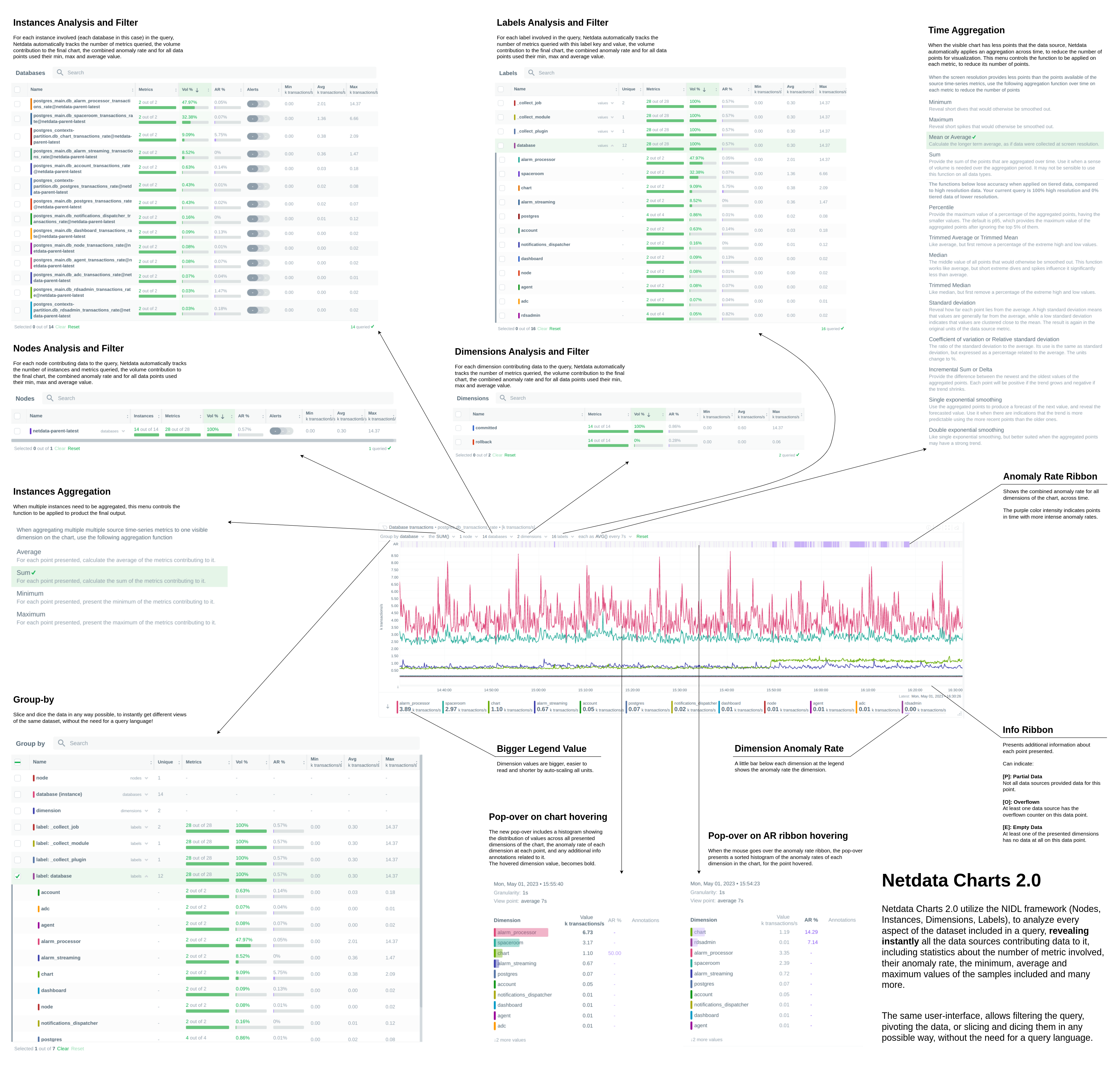
These dropdown menus serve two main functions:
- Provide context about the metrics being visualized.
- Enable flexible grouping and filtering for tailored views.
| Metric Information | Description |
|---|---|
| Volume contribution | Shows how much each metric contributes to the total |
| Anomaly rate | Displays anomaly rate for the selected timeframe |
| Value statistics | Shows minimum, average, and maximum values |
Group By Dropdown
The Group by dropdown allows you to apply different grouping strategies on the same dataset:
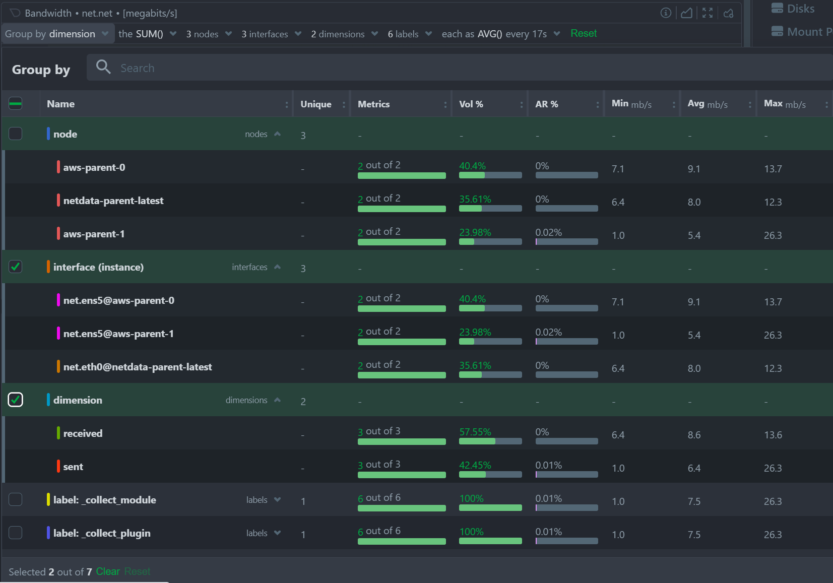
| Grouping Option | Description |
|---|---|
| Group by Node | Summarize data by node with one dimension per node |
| Group by Instance | Summarize data by instance with one dimension per instance |
| Group by Dimension | Aggregate data across all nodes by dimension |
| Group by Label | Summarize data based on label values |
When working with cgroups (VMs and containers), using Group by Instance shows data from all contributing cgroups. Apply additional filters to focus on specific instances and save these views to your dashboards.
Use Group by Instance, Dimension to visualize the time series for each individual collected metric in the chart.
Aggregate Functions Dropdown
Each chart has a default aggregation function, which you can adjust as needed:
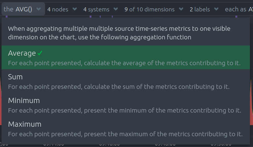
| Function | Description |
|---|---|
| Average | Displays the average value across sources |
| Sum | Shows the sum of all contributed values |
| Min | Displays the minimum value (closest to zero or largest magnitude for negative values) |
| Max | Displays the maximum value (largest magnitude for positive values or closest to zero for negatives) |
Aggregate Functions Over Time – Additional Dropdown Examples
When selecting aggregation functions over time, charts may offer dropdown menus for Percentiles and Trimmed Mean / Median selection. Below are examples of these dropdowns:
Percentile Selection Example:

Trimmed Mean / Median Selection Example:

These options let you control how outliers and edge cases are handled during time-based aggregation.
Nodes Dropdown
Filter and explore the contribution of each node to your chart:
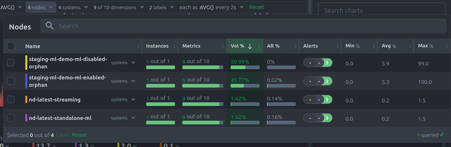
| Node Information | Description |
|---|---|
| Contribution percentage | Shows each node’s share of the total data volume |
| Anomaly rate | Displays anomaly rate per node |
| Error messages | Lists any errors preventing nodes from contributing data |
Instances Dropdown
Use the Instances dropdown to filter or view the contribution of specific instances within your data:
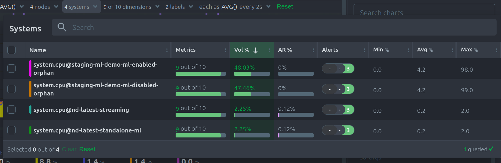
| Instance Information | Description |
|---|---|
| Contribution percentage | Shows how much each instance contributes to the chart volume |
| Anomaly rate | Displays the anomaly rate for each instance |
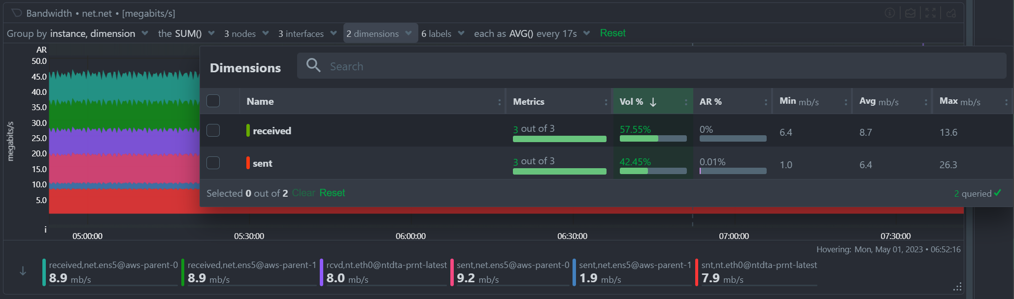
Dimensions Dropdown
The Dimensions dropdown allows you to filter by or focus on particular dimensions within your chart:
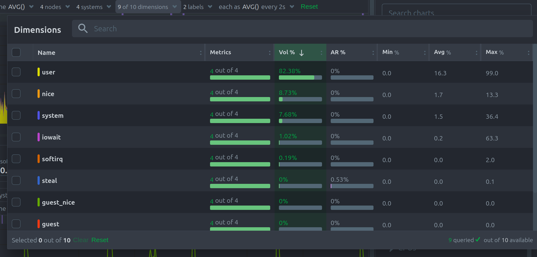
| Dimension Information | Description |
|---|---|
| Contribution percentage | Shows how much each dimension contributes to the chart volume |
| Anomaly rate | Displays the anomaly rate for each dimension |
Labels Dropdown
Filter or view your data by labels, giving you flexibility to isolate metrics by their tags:
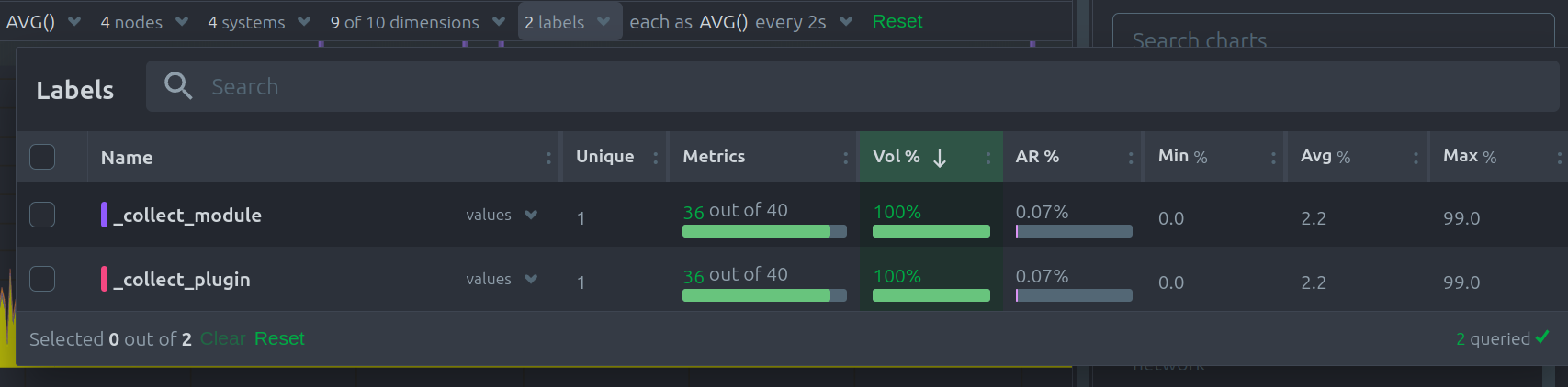
| Label Information | Description |
|---|---|
| Contribution percentage | Shows each label’s contribution to chart volume |
| Anomaly rate | Displays the anomaly rate breakdown by label |
Aggregate Functions Over Time
When data resolution exceeds the chart’s granularity, time-based aggregation is applied. The aggregation function over time ensures that large amounts of data are still readable and insightful.
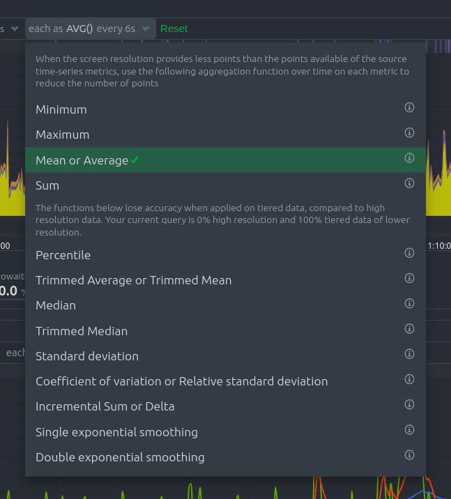
| Aggregation Function | Description |
|---|---|
| Min, Max, Average, Sum | Basic statistical aggregations |
| Percentile (25th–99th) | Show specific percentiles of the data points |
| Trimmed Mean/Median (1%–25%) | Remove outliers before calculating averages |
| Median | Display the middle value of the data set |
| Standard deviation | Measure data variability |
| Coefficient of variation | Show relative variability |
| Delta | Display the change between data points |
| Exponential smoothing | Apply weighted averaging to recent points |
For more details, see Data Queries - Data Grouping.
Reset to Defaults
Click the green Reset button at the end of the Definition bar to restore the chart’s filtering and grouping options to their defaults.
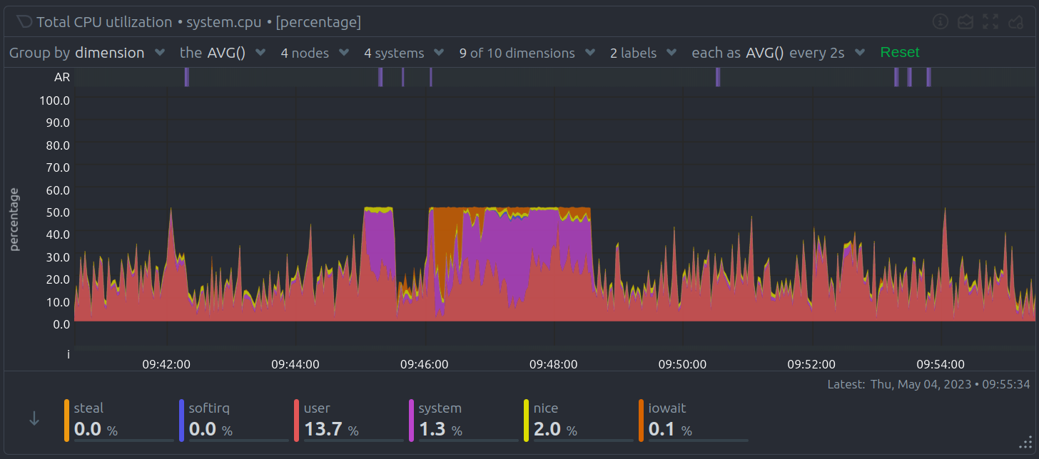
Anomaly Rate Ribbon
Netdata uses machine learning models trained on past data to predict expected metric values. These models identify anomalies in real time as soon as outliers occur.
| Anomaly Ribbon Feature | Description |
|---|---|
| Visual indicator | Shows the combined anomaly rate across all data |
| Hover information | Displays a histogram of anomaly rates per dimension |
| Real-time detection | Flags anomalies within seconds of occurrence |
This feature enables you to catch issues quickly across large volumes of metrics.
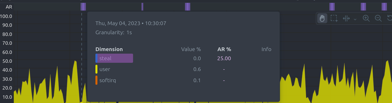
Hover Over the Chart
Hovering over any point on a chart reveals a detailed information overlay, making it easy to explore your metrics interactively:
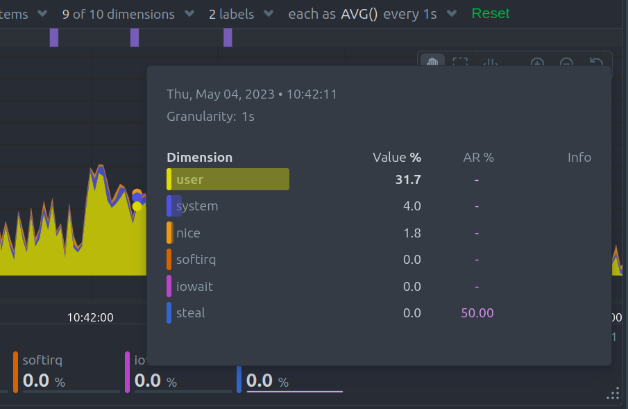
| Hover Information | Description |
|---|---|
| Volume percentage | Shows the contribution of each time series compared to the total |
| Anomaly rate | Displays the anomaly rate for each dimension |
| Collection issues | Indicates any data collection problems |
| Value histogram | Visualizes the distribution of dimension values |
When you hover over the Anomaly Rate ribbon, the dimensions are sorted by anomaly rate, and a histogram displays these rates to help you quickly identify problematic metrics.
Info Column
The Info Column appears during hover and provides detailed data collection insights:
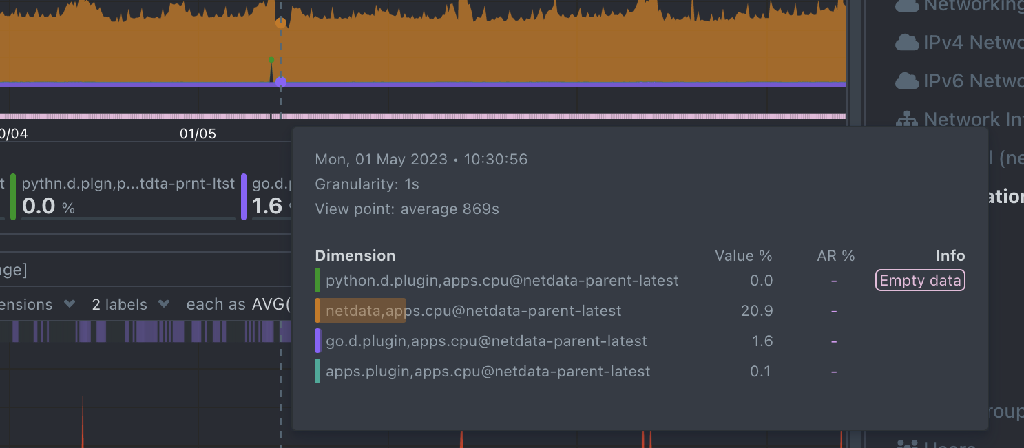
| Indicator | Description |
|---|---|
| Partial Data | At least one dimension has partial data (not all instances contributed fully) |
| Overflown | At least one data source has a counter that overflowed |
| Empty Data | At least one dimension has no data for the selected points |
Play, Pause, and Reset Controls
Control chart playback and interact with time using the Time Controls. These controls help you pause or reset the charts while exploring metrics.
| Interaction | Keyboard / Mouse | Touchpad / Touchscreen | Time Control Effect |
|---|---|---|---|
| Pause chart (temporary) | Hover over the chart | n/a | Temporarily pauses playback |
| Stop chart (lock pause) | Click on the chart | Tap | Locks playback at selected time |
| Reset playback | Double-click on the chart | n/a | Resumes playback (returns to Play mode) |
These controls work when the default “Pan” action is selected in the toolbar.
Toolbar
The chart Toolbar provides interactive tools for manipulating the chart view:
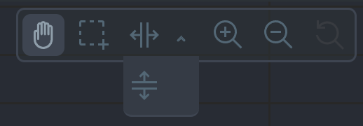
| Tool | Description |
|---|---|
| Pan | Move through the timeline |
| Highlight | Select specific timeframes for analysis |
| Select and Zoom | Zoom into selected timeframes |
| Chart Zoom | Zoom in or out on the chart |
| Reset Zoom | Return to the original view |
Pan
Use the Pan Tool to navigate through time on the chart:
| Pan Interaction | Keyboard | Mouse | Touchpad/Touchscreen |
|---|---|---|---|
| Pan through time | n/a | Click and drag | Touch drag |
Drag right to move backward in time and left to move forward.
Highlight
The Highlight Tool allows you to select timeframes for deeper analysis:
| Highlight Interaction | Keyboard/Mouse | Touchpad/Touchscreen |
|---|---|---|
| Highlight timeframe | Alt + mouse selection or ⌘ + mouse selection (macOS) | n/a |
Use highlighting to investigate spikes, anomalies, or unusual behavior. Click on the chart area to clear the highlight selection.
Select and Zoom
Zoom into specific timeframes for maximum data granularity:
| Zoom Interaction | Keyboard/Mouse | Touchpad/Touchscreen |
|---|---|---|
| Zoom to timeframe | Shift + mouse vertical selection | n/a |
| Horizontal Y-axis zoom | Shift + mouse horizontal selection | n/a |
Zoom In and Out
The Chart Zoom tool allows you to zoom in and out to view different time ranges:
| Zoom Interaction | Keyboard/Mouse | Touchpad/Touchscreen |
|---|---|---|
| Zoom in/out | Shift + mouse scrollwheel | Two-finger pinch or Shift + two-finger scroll |
Zooming in helps you analyze recent events in detail, while zooming out provides an overview of longer-term trends.
Dimensions Bar
The Dimensions Bar allows you to manage how dimensions are displayed within the chart. Sorting and hiding dimensions helps you focus on the most relevant data.
Order Dimensions Legend
You can sort the dimensions legend using various criteria:
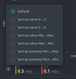
| Sorting Option | Description |
|---|---|
| Dimension name | Sort alphabetically (ascending or descending) |
| Dimension value | Sort by current metric values (ascending or descending) |
| Dimension anomaly rate | Sort by anomaly rate (ascending or descending) |
Show and Hide Dimensions
Simplify your charts by showing only the dimensions you want to focus on:
| Dimension Interaction | Keyboard/Mouse | Touchpad/Touchscreen |
|---|---|---|
| Show one dimension only | Click on the dimension | Tap |
| Toggle individual dimensions | Shift + click | n/a |
This feature is especially useful for identifying unusual behavior by isolating specific metrics.
Resize a Chart
Adjust the height of a chart to fit your analysis needs:
- Resize: Click and drag the resize handle located at the bottom-right corner of the chart.
- Restore original size: Double-click the resize handle.
This allows you to expand charts for more detailed analysis or condense them for a broader dashboard view.
Netdata charts combine clarity, flexibility, and interactivity, designed to help you focus on what matters most in your infrastructure.
Do you have any feedback for this page? If so, you can open a new issue on our netdata/learn repository.